
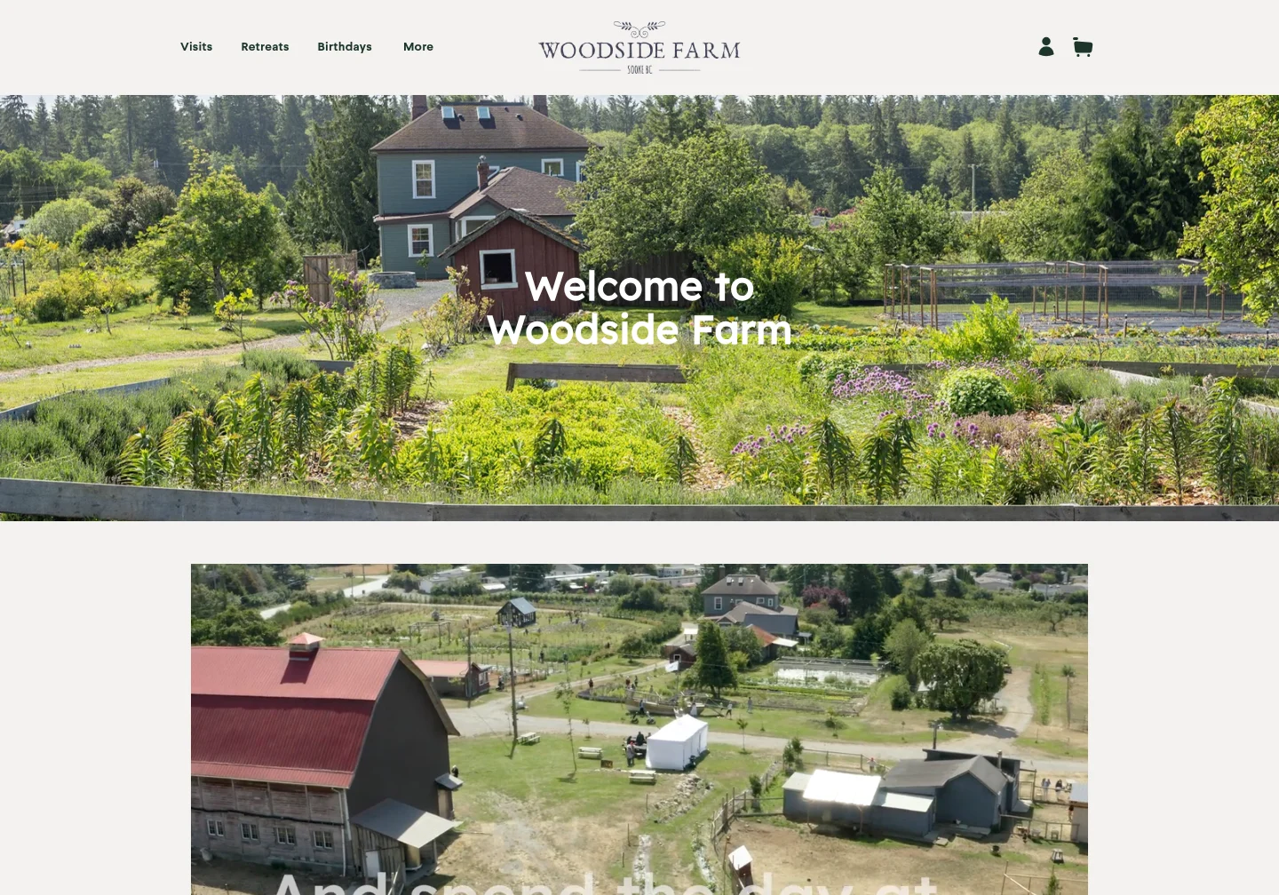
A migration and a redesign solve different problems.
Migration changes the foundation. Redesign changes the presentation. Combining them can be sensible, but it makes it harder to tell whether a missing section or changed page address was intentional.
If your existing design still serves your visitors, carry it into the first preview. Record deliberate design changes separately. You can then evaluate the new CMS without asking the team to approve a new identity at the same time.
Review representative pages, not just the hero.
Choose a page from each important layout. Compare at the same viewport width and account for changing banners, animations, and dynamic content.
| Page or element | Compare the appearance | Test the behavior |
|---|---|---|
| Header and navigation | Logo, spacing, typography, and mobile layout. | Menus, keyboard focus, and destination links. |
| Article | Body width, headings, captions, images, and embeds. | Inline links, sharing links, related articles, and new-post layout. |
| Archive or listing | Cards, grouping, ordering, and page controls. | Pagination, filters, and newly published content. |
| Form or shop page | Labels, fields, product detail, and feedback states. | Submit a test; configure delivery or payments separately. |
Keep the details that make the site yours.
Fonts, image crops, icons, spacing, and content length affect the overall impression. Make sure important assets are available from the source and that you have the right to keep using them on the new site.
Compare phone and desktop layouts separately. A layout can look convincing at one width and still have clipped text, oversized images, or an unusable menu on a smaller screen.
- Check logos and fonts against the original.
- Inspect long headings, tables, and image captions on a phone.
- Try hover, focus, expanded, and error states.
- Check content below the first screen and in the footer.
Make review notes that lead to a useful fix.
Name the page, the screen size, and the expected behavior. “On the contact page at phone width, the submit button extends beyond the form” is more useful than “the mobile version looks wrong.”
Ask for adjustments in Site Design and compare the next preview. Keep a separate list for functionality that needs configuring, such as form delivery, payment credentials, or third-party embeds.
Give the familiar design somewhere to grow.
Once the rebuilt site works and its content is accounted for, you can change the design at your own pace. Start with an improvement that has a purpose: clearer navigation, a stronger service page, or a more useful article index.
Keep testing your existing URLs and core visitor journeys as the design evolves. Visual continuity is useful, but a faithful screenshot alone is not a complete migration.